


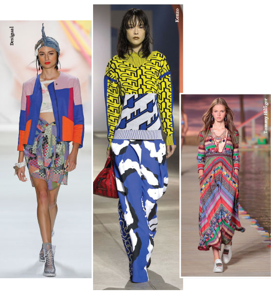
Colour clash is the rule – rainbow style applied in colourful prints, patchwork or even just a mix of bright pieces. The composition works better when the shades scream super-bright and loud contrasting in graphic or bold floral prints. A hint of black or any dark hue intensifies the impact of this colour party.
For those who love a splash of colour, summer is the best time to see yourself as a blank canvas exploring your sense of coordination. The easiest way of doing this is picking a printed piece and pairing it with a solid shade. However, best of all here, is that there is no right way, let a multicolour palette invade your wardrobe and follow your instincts (if they’re not great when it comes to creating a coordinated look, be inspired by the catwalk images and follow our tips).
Dsquared2 and Kenzo took striking prints to another level for outstanding and daring looks. Tommy Hilfiger mixed and matched prints and colours in synchronised and harmonised lines. Christopher Kane was audacious with an unmatched puzzle and a dreamy dress from Chloé shows that colour can spice up any outfit.
Pattern Play
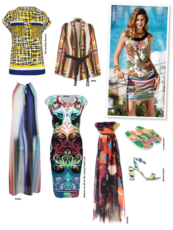
Wearing different prints in a single look can be tricky, so here are some ways of making it work. Stripes and florals make a great duo, but when wearing ethnic or very complex drawings, stick to one piece, such as a dress, or pair with black, white or an earth tone. Another way of putting prints together is to look for those with the same colour palette. The result will be a cool visual effect.
 Editor’s Pick
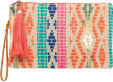
This BHS clutch will add a smart touch to your outfit. Pick an orange dress and shoes and you will have a refreshing summer look.


